![[Matplotlib] Matplotlib 이란?](https://img1.daumcdn.net/thumb/R750x0/?scode=mtistory2&fname=https%3A%2F%2Fblog.kakaocdn.net%2Fdna%2Fpr3QL%2FbtrC8etp6jV%2FAAAAAAAAAAAAAAAAAAAAAFryEqRHldcMnYRF_WG0Zb-HgprsLJbETCNHk0uNoT0a%2Fimg.png%3Fcredential%3DyqXZFxpELC7KVnFOS48ylbz2pIh7yKj8%26expires%3D1764514799%26allow_ip%3D%26allow_referer%3D%26signature%3DrqiJRtu7PXiUhe0Lfbkg3Ru1jVw%253D)
1. Matplotlib
- Python 프로그래밍 언어 및 수학적 확장 NumPy 라이브러리를 활용한 플로팅 라이브러리
1) 기본 세팅
- pyplot : MATLAB의 시각화 기능을 담아 놓음
import matplotlib.pyplot as plt
from matplotlib import rc

rc("font", family="Arial Unicode Ms")
- 마이너스 부호떄문에 한글이 깨질 수 있기 때문에 하는 설정
plt.rcParams["axes.unicode_minus"] = False
rc("font", family="Arial Unicode MS")
- 쥬피터 노트북 내에 그래프를 그리면 바로 나타나게 함
%matplotlib inline
get_ipython().run_line_magic("matplotlib","inline")
2) 그래프 그리기
① plt.figure(figsize=(x, y))
- 캔버스 사이즈 선택
② plt.plot(x, y, 'style', label='')
- 다양한 기능을 포함하고 있으며, 임의의 개수의 인자를 받을 수 있음
- 세번째 인자에 x, y 값 인자에 대해 선의 색상과 형태를 지정하는 포맷 문자열 입력 가능. ex) r--, bs, g^
- 네번째 인자에 label 이름을 붙일 수 있음
    plt.plot(
        t,
        y,
        color="green",
        linestyle="dashed",    # or --
        marker="o",
        markerfacecolor="blue",
        markersize=15,
            )
③ plt.axis([xmin, xmax, ymin, ymax])
- 축의 범위 지정
- plt.xlim([xmin, xmax]), plt.ylim([ymin, ymax])으로 표현 가능
④ plt.grid( )
- 격자선 출력
⑤ plt.show( )
- 그래프를 화면에 출력
plt.figure(figsize=(10,6))
plt.plot([0,1,2,3,4,5,6,7,8,9],[1,1,2,3,4,2,3,5,-1,3], 'ro', label="line")
plt.axis([-1,10,-2,6])
plt.grid()
plt.show()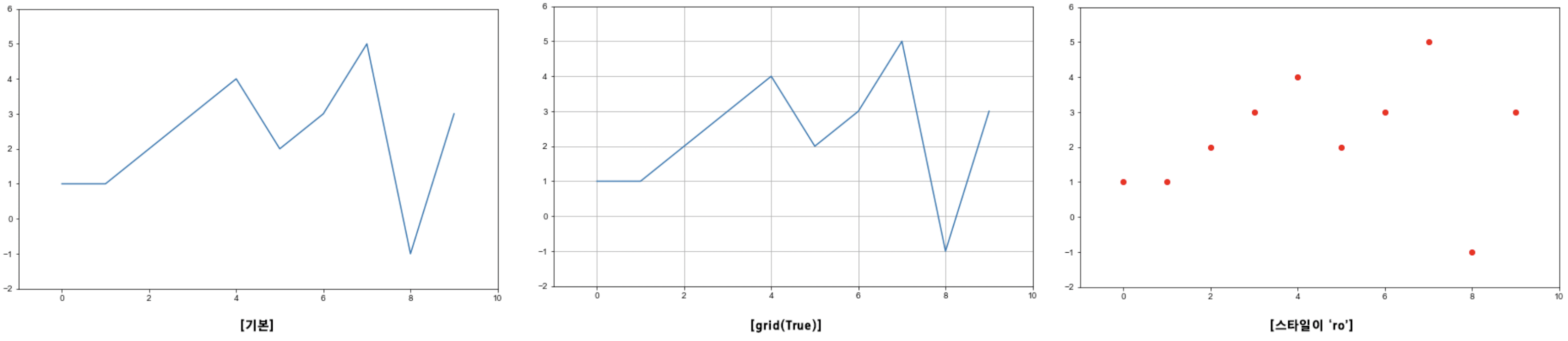
⑥ plt.text(x, y, 'text')
- 적절한 위치에 텍스트 입력
plt.text(df_sort_f["인구수"][0] * 1.02, df_sort_f["소계"][0] * 0.98, df_sort_f.index[0], fontsize=15)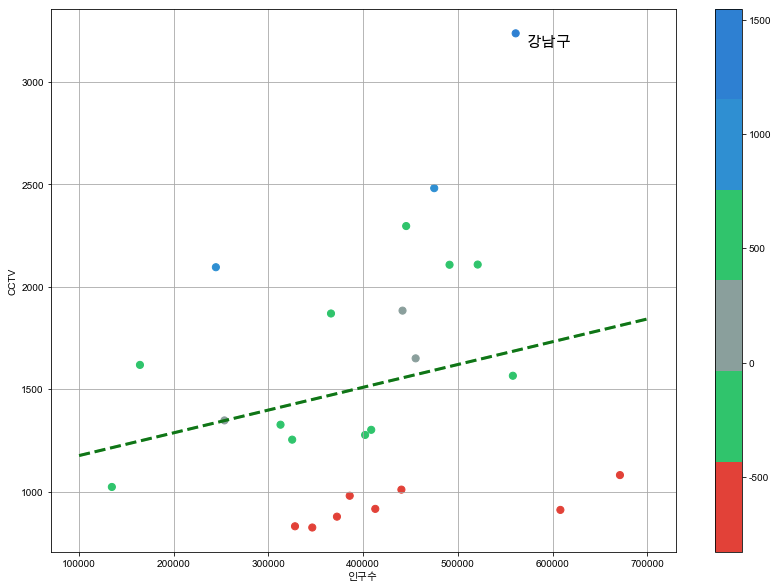
3) 여러 개의 그래프 그리기
- 일반적으로 numpy array를 이용
① plt.title("")
- 그래프 타이틀 출력
② plt.xlabel(""), plt.ylabel("")
- x, y라벨의 타이틀 출력
③ plt.legend(loc=1~10)
- 범례 출력
import numpy as np
t = np.arange(0, 12, 0.01)    # 0부터 12까지 0.01간격으로 출력

plt.figure(figsize=(10, 6))
plt.plot(t, np.sin(t), label="sin")
plt.plot(t, np.cos(t), label="cos")
plt.grid(True)
plt.legend(loc=3)  #범례
plt.title("Example of sinwave")
plt.xlabel("Time")
plt.ylabel("Amplitude")
plt.show()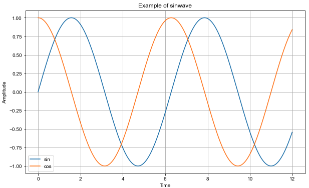
tip) numpy array를 사용하지 않더라도, 모든 시퀀스는 내부적으로numpy array로 변환
2. 참고할만한 사이트
Matplotlib Tutorial - 파이썬으로 데이터 시각화하기
## 도서 소개 - 이 책은 파이썬의 대표적인 데이터 시각화 라이브러리인 Matplotlib의 사용법을 소개합니다. - 30여 개 이상의 다양한 주제에 대해 1 ...
wikidocs.net
Plot types — Matplotlib 3.5.2 documentation
Overview of many common plotting commands in Matplotlib. Note that we have stripped all labels, but they are present by default. See the gallery for many more examples and the tutorials page for longer examples. Unstructured coordinates Sometimes we collec
matplotlib.org
'Python > Python 데이터분석' 카테고리의 다른 글
| [Matplotlib] 데이터 시각화 (0) | 2022.05.27 |
|---|---|
| [Matplotlib] 산점도(Scatter Plot) 그리기 (0) | 2022.05.27 |
| [Pandas] 데이터 병합 (0) | 2022.05.25 |
| [Pandas] 함수 사용 (0) | 2022.05.25 |
| [Pandas] 컬럼 추가 및 제거 (0) | 2022.05.25 |